Contextual Research
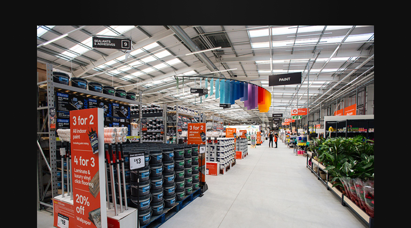
You can't design for the warehouse from a desk. I spent weeks in stores—early morning stock takes, busy Saturday shifts, late-night inventory counts. This revealed problems no specification document could capture.
Redesigning the colleague experience across Location Management, EPOS, and device-agnostic roaming profiles—improving operational efficiency while prioritising accessibility and wellbeing.
B&Q and Castorama stores were struggling with inventory accuracy and order fulfilment. The existing systems were disconnected, leading to:
Store colleagues were the forgotten users. They worked long shifts on their feet, often in challenging lighting conditions, using tools designed decades ago:
I led the UX design for the Store Operations suite, working closely with store colleagues, operations teams, and engineering to understand the real challenges of working in a retail environment.
Spent time in stores across the UK and France, shadowing colleagues and understanding the physical reality of their work environment.
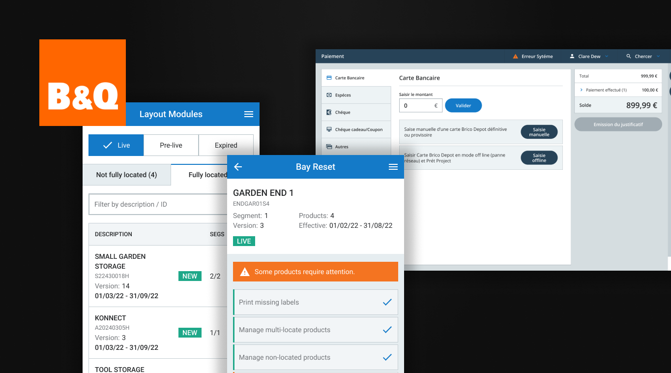
Designed the new location management system for stock allocation, bin locations, and inventory tracking.
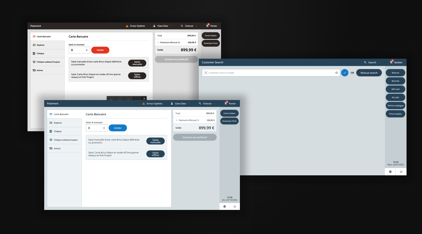
Reimagined the point-of-sale experience to reduce transaction time and training requirements.
Architected a cross-application preference system that followed colleagues between devices and applications.
You can't design for the warehouse from a desk. I spent weeks in stores—early morning stock takes, busy Saturday shifts, late-night inventory counts. This revealed problems no specification document could capture.
The core of the project was a new location management system. Every product needed a clear "home"—a specific bay, shelf, and bin location that both systems and humans could rely on.
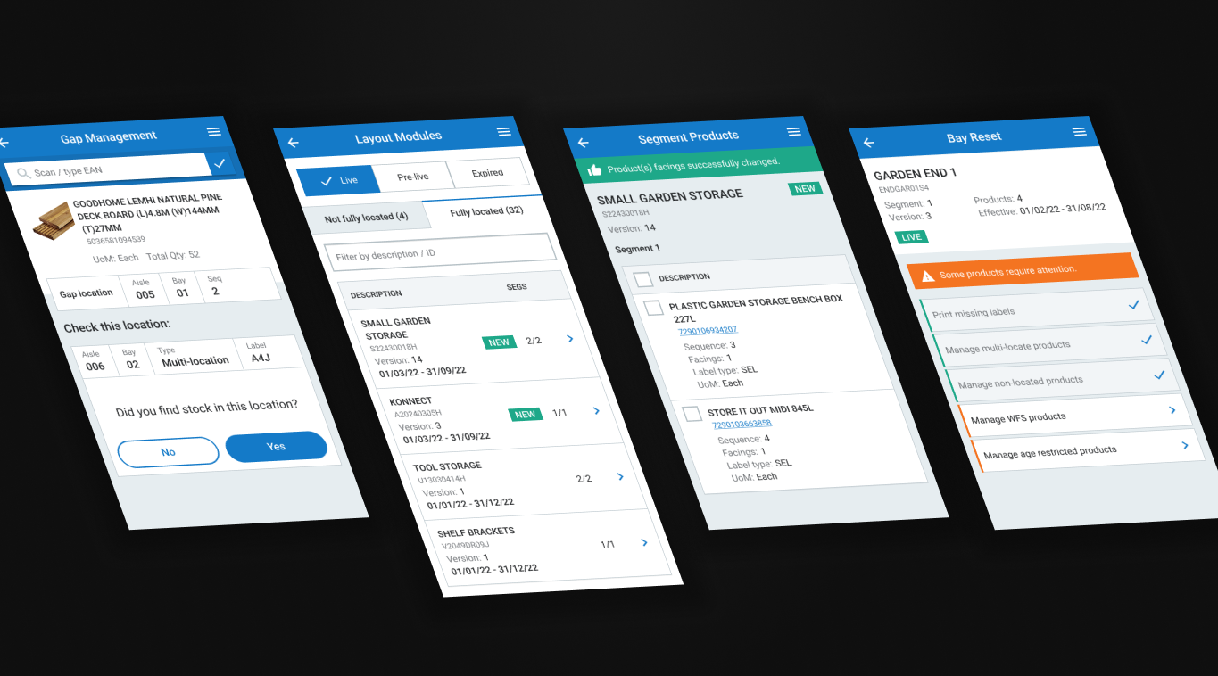
The system allowed colleagues to quickly locate stock, move it between locations, and flag discrepancies. Critically, it fed real-time data back to the website, so online availability became accurate.
The existing EPOS system required extensive training and still caused errors. We designed the new implementation around the most common transactions, reducing cognitive load and making the happy path obvious.
Beyond dark mode, we built comprehensive accessibility features: adjustable font sizes (including an "extra large" option for warehouse use), high contrast modes, and reduced motion options.
The Store Operations platform rolled out across 600+ stores in the UK and France. The impact was measurable across both operational metrics and colleague satisfaction.
Accurate location data meant orders could actually be found and fulfilled.
Rolled out across B&Q UK and Castorama France.
Simplified interface reduced new colleague onboarding time.
Dark mode eliminated the eye strain that had been causing daily discomfort.
Colleague satisfaction with tools increased significantly.
Settings followed colleagues across every device and application.
Designing from an office would have missed the headache problem entirely. Time in the actual environment revealed what users had stopped complaining about.
Features like dark mode and large text weren't just "nice to have"—they directly improved task completion speed and reduced errors.
Colleagues use these tools 8+ hours a day. Investing in their experience has compound returns in efficiency, accuracy, and retention.