Audit & Discovery
Before building anything new, we needed to understand what existed. I led a comprehensive audit across all brands and platforms, cataloguing patterns, identifying inconsistencies, and finding opportunities for consolidation.
Building a unified design language that scales across multiple platforms, products, and international brands while preserving brand identity and accelerating delivery.
Kingfisher operates multiple retail brands across Europe—B&Q in the UK, Castorama in France and Poland, and more. Each brand had evolved its own design patterns, component libraries, and ways of working. This fragmentation meant:
Customers encountered inconsistent interactions and visual language as they moved between touchpoints—website, app, in-store kiosks, and colleague tools. This inconsistency eroded trust and created friction:
I led the design system initiative from strategic vision through to implementation and adoption. This wasn't just about building components—it was about changing how multiple teams across multiple countries approached design and development.
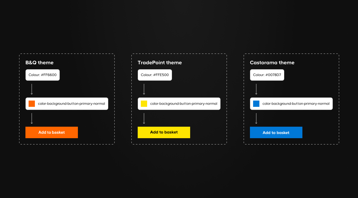
Defined the token architecture, theming approach, and multi-brand strategy that would allow one system to serve distinct brand identities.
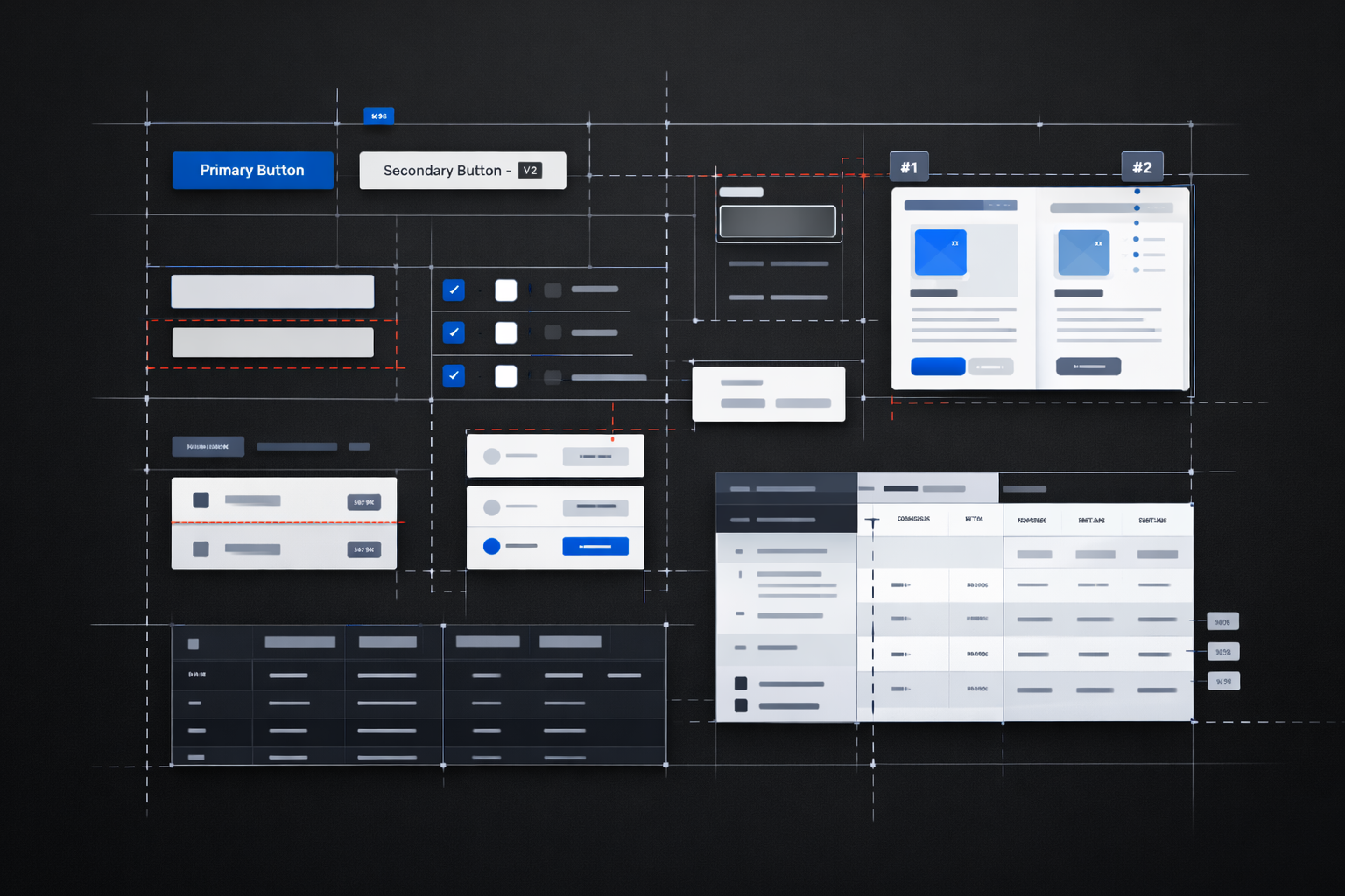
Designed core components with flexibility built in—ensuring they could adapt to different contexts while maintaining consistency.
Established contribution workflows, review processes, and documentation standards that enabled teams to extend the system.
Worked across teams and geographies to drive adoption, running workshops, creating migration guides, and building internal champions.
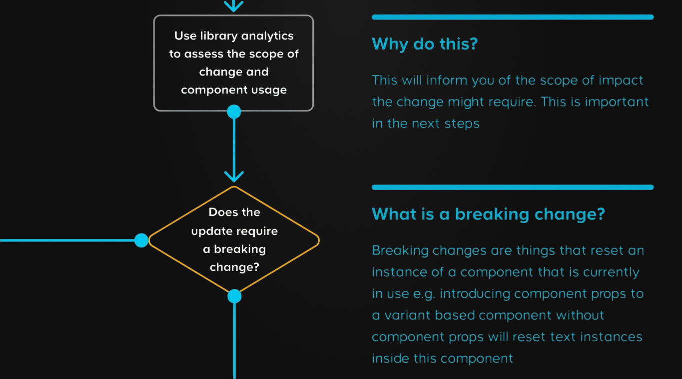
Before building anything new, we needed to understand what existed. I led a comprehensive audit across all brands and platforms, cataloguing patterns, identifying inconsistencies, and finding opportunities for consolidation.
The foundation of a multi-brand system is its token architecture. We designed a two-tier token system: primitive tokens (raw values), and component tokens (specific applications). This was a reflection of the design system maturity of the organisation at the time.
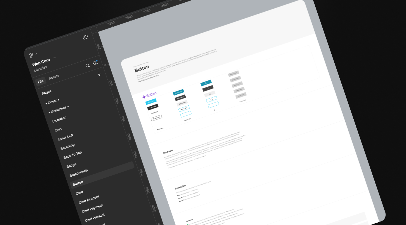
With tokens in place, we built the component library. Each component was designed to be composable, accessible by default, and flexible enough to handle edge cases without breaking patterns.
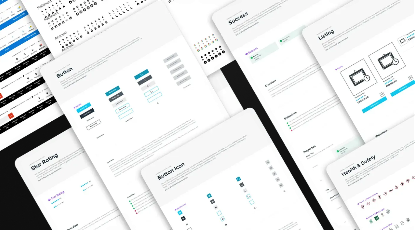
A design system is only as good as its adoption. We created comprehensive documentation, contribution guidelines, and a governance model that balanced consistency with team autonomy.
Design systems succeed when they deliver value to both the business and the end user. We tracked metrics across both dimensions.
Teams spent less time on foundational work and more on product differentiation.
Multiple brand-specific component libraries merged into one shared system.
Within 18 months, 85% of active products were using the design system.
All components met WCAG 2.1 AA standards, some exceeding to AAA.
Simplified interaction patterns meant faster user learning.
Consistent patterns reduced cognitive load across journeys.
The hardest part wasn't designing components—it was changing how teams worked. Success required as much change management as design work.
We launched with 80% of what teams needed and iterated. Waiting for perfection would have meant waiting forever.
Good governance gives teams confidence to contribute. Bad governance makes them avoid the system entirely.